/* deadwoodcamo.com - Build 067 - styles */
/* ---------- Self-hosted fonts (latin woff2, was Google Fonts CDN) ----------
font-display:swap = show fallback immediately, swap in the webfont when ready. */
@font-face { font-family: 'Oswald'; font-style: normal; font-weight: 500; font-display: swap; src: url('/fonts/Oswald-500.woff2') format('woff2'); }
@font-face { font-family: 'Oswald'; font-style: normal; font-weight: 600; font-display: swap; src: url('/fonts/Oswald-600.woff2') format('woff2'); }
@font-face { font-family: 'Oswald'; font-style: normal; font-weight: 700; font-display: swap; src: url('/fonts/Oswald-700.woff2') format('woff2'); }
@font-face { font-family: 'Inter'; font-style: normal; font-weight: 400; font-display: swap; src: url('/fonts/Inter-400.woff2') format('woff2'); }
@font-face { font-family: 'Inter'; font-style: normal; font-weight: 500; font-display: swap; src: url('/fonts/Inter-500.woff2') format('woff2'); }
@font-face { font-family: 'Inter'; font-style: normal; font-weight: 600; font-display: swap; src: url('/fonts/Inter-600.woff2') format('woff2'); }
*, *::before, *::after { margin: 0; padding: 0; box-sizing: border-box; }
:root {
--bg: #14140f; /* near-black earth */
--panel: #1e1d16;
--ink: #f2efe6; /* sand white */
--muted: #a39c86; /* faded olive */
--line: rgba(242,239,230,0.12);
--olive: #4a5136;
--olive-lt: #6f7a4e;
--brown: #5c4632;
--sand: #c9b78f;
--accent: #d8863b; /* signature ember, used sparingly */
--yes: #7c9a4e; /* muted olive green, "works great" */
--no: #c0563d; /* earthy brick red, "avoid" */
--maxw: 1120px;
}
html { scroll-behavior: smooth; }
body {
font-family: 'Inter', 'Helvetica Neue', Helvetica, Arial, sans-serif;
background: var(--bg);
color: var(--ink);
line-height: 1.55;
overflow-x: hidden;
-webkit-font-smoothing: antialiased;
}
a { color: inherit; text-decoration: none; }
/* height:auto so an image whose width is overridden by CSS keeps its aspect ratio
instead of using its HTML height attribute (fixed-aspect containers set height:100% and override this). */
img { display: block; max-width: 100%; height: auto; }
h1, h2, .brand__wordmark, .style__num {
font-family: 'Oswald', 'Arial Narrow', Arial, sans-serif;
text-transform: uppercase;
letter-spacing: 0.02em;
line-height: 1.05;
}
:focus-visible {
outline: 3px solid var(--accent);
outline-offset: 2px;
}
/* ---------- Buttons ---------- */
.btn {
display: inline-block;
background: var(--accent);
color: #14140f;
font-weight: 600;
font-size: 15px;
padding: 14px 26px;
border-radius: 2px;
letter-spacing: 0.02em;
transition: transform 0.15s ease, background 0.15s ease;
}
.btn:hover { background: #e59a4f; transform: translateY(-1px); }
.btn--sm { padding: 10px 18px; font-size: 14px; }
/* ---------- Header ---------- */
.site-header {
position: sticky;
top: 0;
z-index: 20;
display: flex;
align-items: center;
justify-content: space-between;
gap: 16px;
padding: 14px 24px;
background: rgba(20,20,15,0.85);
backdrop-filter: blur(8px);
border-bottom: 1px solid var(--line);
}
.brand { display: flex; align-items: center; gap: 14px; }
.brand__logo { height: 34px; width: auto; }
.brand__wordmark { font-size: 18px; font-weight: 700; }
.brand__at { color: var(--muted); font-weight: 500; }
/* Right-side nav: click-to-call + quote button. The phone number is the primary
ad call-to-action, so it stays visible; on the smallest screens the quote button
drops (in-page CTAs cover it) and the number holds. */
.site-nav { display: flex; align-items: center; gap: 16px; }
.site-nav__call {
display: inline-flex; align-items: center; gap: 8px;
font-family: 'Oswald', 'Arial Narrow', Arial, sans-serif;
text-transform: uppercase; letter-spacing: 0.03em;
font-weight: 600; font-size: 16px; color: var(--ink); white-space: nowrap;
transition: color 0.15s ease;
}
.site-nav__call:hover { color: var(--accent); }
.site-nav__call-ico { width: 18px; height: 18px; color: var(--accent); flex: none; }
/* Quiet text link (About) beside the call + quote CTAs; drops on phones with the quote btn */
.site-nav__link {
font-family: 'Oswald', 'Arial Narrow', Arial, sans-serif;
text-transform: uppercase; letter-spacing: 0.03em;
font-weight: 500; font-size: 15px; color: var(--muted); white-space: nowrap;
transition: color 0.15s ease;
}
.site-nav__link:hover { color: var(--ink); }
/* ---------- Hero (signature element) ---------- */
.hero {
position: relative;
/* "Not quite" full screen; the headline overlays the images, bottom-left. */
height: 80vh;
display: flex;
align-items: flex-end;
overflow: hidden;
}
.hero__media { position: absolute; inset: 0; }
.hero__media img { width: 100%; height: 100%; object-fit: cover; }
/* grid-template-rows must be definite (1fr against the fixed hero height), or the
images fall back to intrinsic height and object-fit/object-position do nothing. */
.hero__media--split { display: grid; grid-template-columns: 1fr 1fr; grid-template-rows: 1fr; }
/* min-height:0 lets the images shrink into the 1fr row; without it their default
min-height:auto forces the row to their intrinsic height and cover/position break. */
.hero__media--split img { min-height: 0; }
/* Frame each shot independently so the two subjects line up at the same height
below the header. Higher % hides more dead space above the subject. */
.hero__media--split img:nth-child(1) { object-position: center 26%; } /* woman: trim top a little */
.hero__media--split img:nth-child(2) { object-position: center 49%; } /* man: trim a lot more */
/* Bottom-weighted scrim just for headline legibility (not a full-width wash) */
.hero::after {
content: "";
position: absolute; inset: 0;
z-index: 1;
background: linear-gradient(180deg, transparent 45%, rgba(20,20,15,0.72) 100%);
pointer-events: none;
}
/* Headline overlay, drops in shortly after the images load */
.hero__panel {
position: relative;
z-index: 2;
max-width: var(--maxw);
width: 100%;
margin: 0 auto;
padding: 0 24px 48px;
animation: heroDrop 0.7s cubic-bezier(0.2, 0.7, 0.2, 1) 0.35s both;
}
.hero__panel > * { text-shadow: 0 0 14px rgba(0,0,0,0.55), 0 2px 4px rgba(0,0,0,0.6); }
@keyframes heroDrop {
from { opacity: 0; transform: translateY(-28px); }
to { opacity: 1; transform: translateY(0); }
}
.eyebrow {
color: var(--sand);
font-size: 13px;
letter-spacing: 0.18em;
text-transform: uppercase;
margin-bottom: 14px;
}
.hero__panel h1 {
font-size: clamp(36px, 6vw, 76px);
font-weight: 700;
max-width: 16ch;
}
.hero__sub {
color: var(--ink);
font-size: clamp(16px, 2vw, 19px);
max-width: 52ch;
margin: 18px 0 26px;
}
/* Primary quote button + secondary click-to-call, side by side */
.hero__cta { display: flex; align-items: center; gap: 20px; flex-wrap: wrap; }
.hero__call {
color: var(--ink); font-weight: 600; font-size: 16px;
text-decoration: underline; text-underline-offset: 3px; white-space: nowrap;
transition: color 0.15s ease;
}
.hero__call:hover { color: var(--accent); }
/* ---------- Product tile row (asscolour pattern) ---------- */
.cat-row {
display: grid;
grid-template-columns: repeat(4, 1fr);
gap: 2px;
background: var(--line);
border-bottom: 1px solid var(--line);
}
.tile {
position: relative;
overflow: hidden;
display: block;
background: #17171a;
height: 62vh;
min-height: 340px;
}
.tile img {
position: absolute; inset: 0;
width: 100%; height: 100%;
object-fit: cover;
transition: transform 0.6s ease;
}
.tile:hover img, .tile:focus-visible img { transform: scale(1.06); }
.tile::after {
content: "";
position: absolute; inset: 0;
/* Darken BOTH ends: top scrim for the title, bottom scrim for the style number
(the bottom-left number was washing out over light parts of a photo). */
background: linear-gradient(to bottom,
rgba(20,20,15,0.74) 0%,
rgba(20,20,15,0.12) 32%,
rgba(20,20,15,0) 58%,
rgba(20,20,15,0.62) 100%);
pointer-events: none;
}
/* Title pinned top-left, style number pinned bottom-left (space-between) so the
two are not crowded together. Label fills the tile; pointer-events off so it
never interferes with the tile link. */
.tile-label {
position: absolute; inset: 0; padding: 22px 24px; z-index: 2;
display: flex; flex-direction: column; justify-content: space-between;
pointer-events: none;
}
.tile-label .t {
font-family: 'Oswald', Arial, sans-serif; text-transform: uppercase; letter-spacing: 0.02em;
font-size: clamp(20px, 2.2vw, 32px); font-weight: 600; line-height: 1.05;
text-shadow: 0 2px 18px rgba(0,0,0,0.55);
}
.tile-label .s {
font-size: 12px; font-weight: 600;
letter-spacing: 0.14em; text-transform: uppercase; color: var(--sand);
/* stronger shadow: the bottom of the tile has no scrim, so the number needs
to hold up over lighter parts of a photo */
text-shadow: 0 1px 4px rgba(0,0,0,0.9), 0 1px 14px rgba(0,0,0,0.7);
}
@media (max-width: 860px) { .cat-row { grid-template-columns: 1fr 1fr; } .tile { height: 52vh; } }
@media (max-width: 460px) { .cat-row { grid-template-columns: 1fr; } }
/* Cross-sell row on product pages: the 4 sibling styles, 4-up and a touch shorter */
.section--more { padding-bottom: 10px; }
.section--more .section__head { margin-bottom: 6px; }
.cat-row--more { grid-template-columns: repeat(4, 1fr); }
.cat-row--more .tile { height: 44vh; min-height: 300px; }
@media (max-width: 860px) { .cat-row--more { grid-template-columns: 1fr 1fr; } }
@media (max-width: 460px) { .cat-row--more { grid-template-columns: 1fr; } }
/* Homepage product row: 5 styles across, height trimmed so the narrower tiles keep
good proportions. Wraps 5 -> 2 -> 1; the odd tile spans full width at 2-up so
there is no orphan gap. These rules come after the base .cat-row block so they win. */
.cat-row--home { grid-template-columns: repeat(5, 1fr); }
.cat-row--home .tile { height: 54vh; }
@media (max-width: 900px) {
.cat-row--home { grid-template-columns: 1fr 1fr; }
.cat-row--home .tile { height: 46vh; }
.cat-row--home .tile:last-child { grid-column: 1 / -1; }
}
@media (max-width: 460px) {
.cat-row--home { grid-template-columns: 1fr; }
.cat-row--home .tile:last-child { grid-column: auto; }
}
/* ---------- Sections ---------- */
.section {
max-width: var(--maxw);
margin: 0 auto;
padding: 60px 24px;
}
.section__head { margin-bottom: 32px; }
.section h2 { font-size: clamp(26px, 4vw, 40px); font-weight: 600; }
.section__note { color: var(--muted); margin-top: 10px; max-width: 60ch; }
.lede { font-size: clamp(18px, 2.4vw, 22px); max-width: 62ch; color: var(--ink); }
/* ---------- Style numbers ---------- */
.styles {
list-style: none;
display: grid;
grid-template-columns: repeat(auto-fit, minmax(220px, 1fr));
gap: 16px;
}
.style {
border: 1px solid var(--line);
border-radius: 3px;
padding: 22px;
background: var(--panel);
display: flex;
flex-direction: column;
gap: 6px;
}
.style__num { font-size: 22px; font-weight: 700; color: var(--sand); }
.style__name { font-weight: 600; }
.style__spec { color: var(--muted); font-size: 14px; }
.style--more { border-style: dashed; opacity: 0.8; }
.style--link { padding: 0; transition: border-color 0.15s ease, transform 0.15s ease; }
.style--link:hover { border-color: var(--accent); transform: translateY(-2px); }
.style__link { display: flex; flex-direction: column; gap: 6px; padding: 22px; height: 100%; }
.style__cta { color: var(--accent); font-weight: 600; font-size: 14px; margin-top: 6px; }
/* Mannequin photo on a style tile: full-bleed light tile at the top of the card */
.style__img { margin: -22px -22px 14px; background: #ece7db; aspect-ratio: 4 / 5; overflow: hidden; border-radius: 3px 3px 0 0; }
.style__img img { width: 100%; height: 100%; object-fit: contain; }
/* ---------- Product page ---------- */
.product { max-width: var(--maxw); margin: 0 auto; padding: 48px 24px 24px; display: grid; grid-template-columns: 1fr 1fr; gap: 36px; align-items: start; }
/* Cap the lead shot height and frame from the top so a very tall portrait photo
does not tower over the info column and leave dead space beside it. */
.product__media img { width: 100%; border-radius: 3px; max-height: 78vh; object-fit: cover; object-position: center 22%; }
.product__eyebrow { color: var(--sand); font-size: 13px; letter-spacing: 0.18em; text-transform: uppercase; margin-bottom: 12px; }
.product__info h1 { font-size: clamp(32px, 5vw, 52px); font-weight: 700; }
.product__style { color: var(--muted); margin: 10px 0 18px; font-size: 15px; letter-spacing: 0.04em; }
.product__info p { max-width: 46ch; margin-bottom: 20px; }
.product__specs { list-style: none; display: flex; flex-wrap: wrap; gap: 8px; margin-bottom: 26px; }
.product__specs li { border: 1px solid var(--line); border-radius: 999px; padding: 6px 14px; font-size: 13px; color: var(--ink); }
.product__cta { display: flex; align-items: center; gap: 18px; flex-wrap: wrap; margin-bottom: 10px; }
@media (max-width: 760px) { .product { grid-template-columns: 1fr; padding-top: 28px; } }
.studio { display: grid; grid-template-columns: repeat(auto-fit, minmax(220px, 1fr)); gap: 12px; }
.studio__item { background: #ece7db; border-radius: 3px; aspect-ratio: 3 / 4; overflow: hidden; }
.studio__item img { width: 100%; height: 100%; object-fit: contain; }
.backlink { display: inline-flex; align-items: center; gap: 6px; color: var(--muted); font-size: 14px; margin-top: 6px; }
.backlink:hover { color: var(--sand); }
/* ---------- Product details + printing tips ---------- */
.details { max-width: 760px; }
.details__desc { color: var(--ink); margin-bottom: 22px; }
.spec-list { list-style: none; display: grid; gap: 9px; margin-bottom: 22px; }
.spec-list li { position: relative; padding-left: 20px; color: var(--muted); }
.spec-list li::before {
content: ""; position: absolute; left: 0; top: 9px;
width: 6px; height: 6px; background: var(--olive-lt); border-radius: 1px;
}
.details__sizes { color: var(--ink); font-size: 15px; margin-bottom: 24px; }
.details__sizes strong { color: var(--sand); font-weight: 600; letter-spacing: 0.02em; }
.tips { list-style: none; display: grid; gap: 12px; max-width: 760px; }
.tips li { position: relative; padding-left: 26px; color: var(--ink); }
.tips li::before {
content: ""; position: absolute; left: 0; top: 7px;
width: 10px; height: 10px; border: 2px solid var(--accent); border-radius: 999px;
}
.tips li.tips--hood { color: var(--sand); }
.tips li.tips--hood::before { background: var(--accent); }
/* ---------- Gallery ---------- */
.gallery {
display: grid;
grid-template-columns: repeat(auto-fit, minmax(220px, 1fr));
gap: 12px;
}
.gallery__item { overflow: hidden; border-radius: 3px; background: var(--panel); aspect-ratio: 1 / 1; }
.gallery__item img { width: 100%; height: 100%; object-fit: cover; transition: transform 0.4s ease; }
.gallery__item:hover img { transform: scale(1.04); }
/* Empty placeholder slot (awaiting a real photo). To wire a photo, replace the whole
Photo with
 . */
.gallery__item--ph {
border: 1px dashed var(--line);
display: flex; align-items: center; justify-content: center;
}
.gallery__item--ph span { color: var(--muted); font-size: 11px; letter-spacing: 0.14em; text-transform: uppercase; }
/* ---------- Camo design guide (visual do / don't) ---------- */
.camo-guide { display: grid; grid-template-columns: 1fr 1fr; gap: 40px; }
.camo-guide__col { min-width: 0; }
.camo-guide__label {
font-family: 'Oswald', 'Arial Narrow', Arial, sans-serif;
text-transform: uppercase; letter-spacing: 0.03em;
font-size: clamp(17px, 2vw, 21px); font-weight: 600;
display: flex; align-items: center; gap: 10px; margin-bottom: 18px;
}
.camo-guide__ico { width: 24px; height: 24px; flex: none; }
.camo-guide__col--yes .camo-guide__ico { color: var(--yes); }
.camo-guide__col--no .camo-guide__ico { color: var(--no); }
.camo-guide__grid { display: grid; grid-template-columns: repeat(3, 1fr); gap: 12px; }
.camo-guide__card { min-width: 0; }
/* Placeholder and the eventual
. */
.gallery__item--ph {
border: 1px dashed var(--line);
display: flex; align-items: center; justify-content: center;
}
.gallery__item--ph span { color: var(--muted); font-size: 11px; letter-spacing: 0.14em; text-transform: uppercase; }
/* ---------- Camo design guide (visual do / don't) ---------- */
.camo-guide { display: grid; grid-template-columns: 1fr 1fr; gap: 40px; }
.camo-guide__col { min-width: 0; }
.camo-guide__label {
font-family: 'Oswald', 'Arial Narrow', Arial, sans-serif;
text-transform: uppercase; letter-spacing: 0.03em;
font-size: clamp(17px, 2vw, 21px); font-weight: 600;
display: flex; align-items: center; gap: 10px; margin-bottom: 18px;
}
.camo-guide__ico { width: 24px; height: 24px; flex: none; }
.camo-guide__col--yes .camo-guide__ico { color: var(--yes); }
.camo-guide__col--no .camo-guide__ico { color: var(--no); }
.camo-guide__grid { display: grid; grid-template-columns: repeat(3, 1fr); gap: 12px; }
.camo-guide__card { min-width: 0; }
/* Placeholder and the eventual ![]() share the square frame so swapping one for the
other needs no layout change. To wire a real photo: replace the .camo-guide__ph
div with
share the square frame so swapping one for the
other needs no layout change. To wire a real photo: replace the .camo-guide__ph
div with  . */
.camo-guide__ph, .camo-guide__card img {
width: 100%; aspect-ratio: 1 / 1; border-radius: 3px; display: block;
object-fit: cover;
}
.camo-guide__ph {
background: var(--panel);
border: 1px dashed var(--line);
display: flex; align-items: center; justify-content: center;
color: var(--muted); font-size: 11px; letter-spacing: 0.14em; text-transform: uppercase;
}
.camo-guide__col--yes .camo-guide__card { border-top: 3px solid var(--yes); }
.camo-guide__col--no .camo-guide__card { border-top: 3px solid var(--no); }
.camo-guide__card { border-radius: 3px 3px 0 0; }
.camo-guide__card figcaption {
margin-top: 10px; font-size: 14px; font-weight: 500; color: var(--ink); line-height: 1.35;
}
@media (max-width: 760px) {
.camo-guide { grid-template-columns: 1fr; gap: 32px; }
}
/* ---------- About page ---------- */
.section h1 { font-size: clamp(30px, 5vw, 48px); font-weight: 700; }
.about__lead { font-size: clamp(18px, 2.4vw, 22px); max-width: 60ch; color: var(--ink); margin-top: 12px; }
.about__body { max-width: 64ch; margin: 28px 0; }
.about__body p { margin-bottom: 16px; }
/* Team photo: placeholder and eventual
. */
.camo-guide__ph, .camo-guide__card img {
width: 100%; aspect-ratio: 1 / 1; border-radius: 3px; display: block;
object-fit: cover;
}
.camo-guide__ph {
background: var(--panel);
border: 1px dashed var(--line);
display: flex; align-items: center; justify-content: center;
color: var(--muted); font-size: 11px; letter-spacing: 0.14em; text-transform: uppercase;
}
.camo-guide__col--yes .camo-guide__card { border-top: 3px solid var(--yes); }
.camo-guide__col--no .camo-guide__card { border-top: 3px solid var(--no); }
.camo-guide__card { border-radius: 3px 3px 0 0; }
.camo-guide__card figcaption {
margin-top: 10px; font-size: 14px; font-weight: 500; color: var(--ink); line-height: 1.35;
}
@media (max-width: 760px) {
.camo-guide { grid-template-columns: 1fr; gap: 32px; }
}
/* ---------- About page ---------- */
.section h1 { font-size: clamp(30px, 5vw, 48px); font-weight: 700; }
.about__lead { font-size: clamp(18px, 2.4vw, 22px); max-width: 60ch; color: var(--ink); margin-top: 12px; }
.about__body { max-width: 64ch; margin: 28px 0; }
.about__body p { margin-bottom: 16px; }
/* Team photo: placeholder and eventual ![]() share the same 3:2 frame, so swapping
one for the other needs no layout change. Replace the .about__photo-ph div with
share the same 3:2 frame, so swapping
one for the other needs no layout change. Replace the .about__photo-ph div with
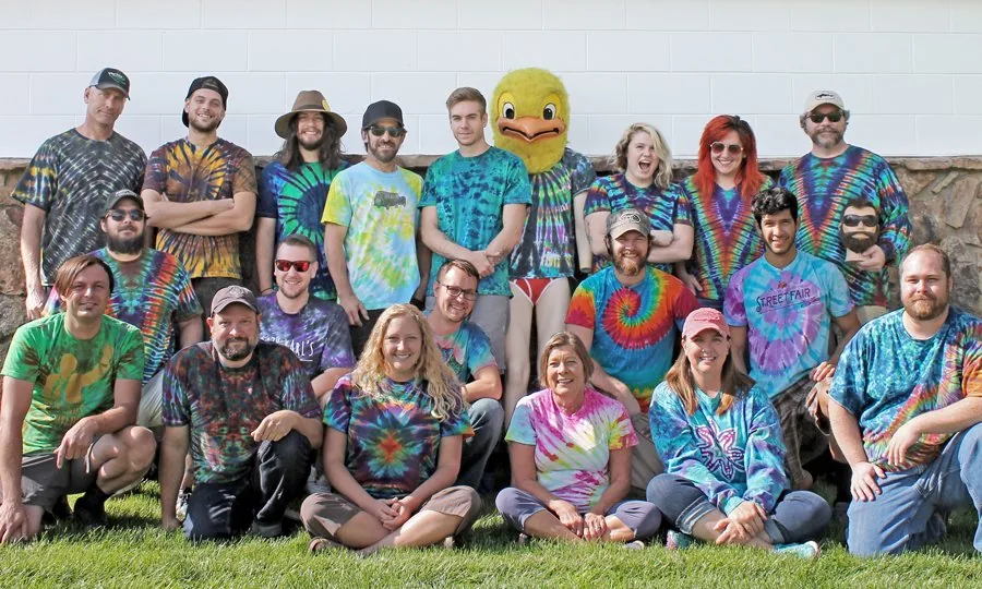 . */
.about__photo, .about__photo-ph {
width: 100%; aspect-ratio: 3 / 2; border-radius: 4px; object-fit: cover; display: block;
}
/* Real team photo is 5:3 (900x540) - use its native ratio so the whole crew shows uncropped. */
.about__photo { aspect-ratio: 5 / 3; }
.about__photo-ph {
background: var(--panel); border: 1px dashed var(--line);
display: flex; align-items: center; justify-content: center;
color: var(--muted); font-size: 12px; letter-spacing: 0.14em; text-transform: uppercase;
}
.about__stats { list-style: none; display: grid; grid-template-columns: repeat(3, 1fr); gap: 14px; margin: 28px 0; }
.about__stat { border: 1px solid var(--line); border-left: 3px solid var(--olive-lt); border-radius: 3px; padding: 20px; background: var(--panel); }
.about__stat b {
font-family: 'Oswald', 'Arial Narrow', Arial, sans-serif; text-transform: uppercase; letter-spacing: 0.02em;
display: block; font-size: 20px; font-weight: 600; color: var(--sand); line-height: 1.1; margin-bottom: 6px;
}
.about__stat span { color: var(--muted); font-size: 14px; }
.about__more { display: flex; gap: 18px; align-items: center; flex-wrap: wrap; margin-top: 8px; }
.btn--ghost { background: transparent; color: var(--ink); border: 1px solid var(--line); }
.btn--ghost:hover { background: rgba(255,255,255,0.06); border-color: var(--sand); transform: translateY(-1px); }
@media (max-width: 640px) { .about__stats { grid-template-columns: 1fr; } }
/* ---------- How it works (3 steps) ---------- */
.steps { list-style: none; display: grid; grid-template-columns: repeat(3, 1fr); gap: 16px; counter-reset: step; }
.step { border: 1px solid var(--line); border-radius: 3px; padding: 26px 24px; background: var(--panel); }
.step::before {
counter-increment: step; content: "0" counter(step);
display: block; font-family: 'Oswald', 'Arial Narrow', Arial, sans-serif;
font-size: 34px; font-weight: 700; color: var(--accent); line-height: 1; margin-bottom: 14px;
}
.step h3 {
font-family: 'Oswald', 'Arial Narrow', Arial, sans-serif; text-transform: uppercase; letter-spacing: 0.02em;
font-size: 19px; font-weight: 600; margin-bottom: 10px;
}
.step p { color: var(--muted); font-size: 15px; }
@media (max-width: 760px) { .steps { grid-template-columns: 1fr; } }
/* ---------- Reviews ---------- */
.reviews {
display: grid;
grid-template-columns: repeat(auto-fit, minmax(260px, 1fr));
gap: 16px;
}
.review {
border: 1px solid var(--line);
border-left: 3px solid var(--olive-lt);
border-radius: 3px;
padding: 22px;
background: var(--panel);
}
.review p { margin-bottom: 14px; }
.review cite { color: var(--muted); font-style: normal; font-size: 14px; display: block; }
.review__date { display: block; color: var(--muted); font-size: 12px; opacity: 0.75; margin-top: 3px; }
.g-rating { display: flex; align-items: center; gap: 10px; margin-top: 14px; }
.g-stars { display: inline-flex; gap: 2px; color: var(--accent); }
.g-stars svg { width: 18px; height: 18px; }
.g-rating strong { font-size: 18px; }
.g-meta { color: var(--muted); font-size: 14px; }
.g-link { display: inline-block; margin-top: 22px; color: var(--sand); font-size: 14px; text-decoration: underline; }
/* ---------- FAQ ---------- */
.faq { max-width: 760px; }
.faq__item { border-bottom: 1px solid var(--line); }
.faq__item summary {
cursor: pointer;
list-style: none;
padding: 20px 0;
font-size: clamp(16px, 2vw, 19px);
font-weight: 600;
color: var(--ink);
display: flex;
justify-content: space-between;
align-items: center;
gap: 20px;
}
.faq__item summary::-webkit-details-marker { display: none; }
.faq__item summary::after { content: "+"; color: var(--accent); font-size: 26px; font-weight: 400; line-height: 1; }
.faq__item[open] summary::after { content: "\2013"; }
.faq__a { padding: 0 0 22px; color: var(--muted); max-width: 66ch; }
.faq__a a { color: var(--sand); text-decoration: underline; }
/* ---------- Quote ---------- */
.section--quote { border-top: 1px solid var(--line); }
/* Native quote form mount (built by form.js, posts to /api/lead).
Left-aligned (not centered) so it lines up under the section header - the whole
site reads as one left spine (hero, tiles, product pages all left-anchored). */
.quote__form { max-width: 640px; margin: 0; }
/* ---------- Native quote form ---------- */
.lead-form { display: grid; gap: 20px; color-scheme: dark; }
.lf-row { display: grid; gap: 8px; }
.lf-row--2 { grid-template-columns: 1fr 1fr; gap: 16px; }
.lf-field { display: grid; gap: 8px; }
.lf-label {
font-family: 'Oswald', 'Arial Narrow', Arial, sans-serif;
text-transform: uppercase; letter-spacing: 0.03em; font-size: 14px; font-weight: 600; color: var(--sand);
}
.lf-label em { color: var(--accent); font-style: normal; }
.lf-hint {
display: block; text-transform: none; letter-spacing: 0;
font-family: 'Inter', sans-serif; font-weight: 400; font-size: 12px; color: var(--muted); margin-top: 3px;
}
.lead-form input[type="text"], .lead-form input[type="email"], .lead-form input[type="tel"],
.lead-form input[type="date"], .lead-form select, .lead-form textarea {
width: 100%; background: var(--panel); border: 1px solid var(--line); border-radius: 4px;
color: var(--ink); font: inherit; font-size: 15px; padding: 12px 14px;
transition: border-color 0.15s ease, box-shadow 0.15s ease;
}
.lead-form textarea { resize: vertical; min-height: 110px; }
.lead-form input::placeholder, .lead-form textarea::placeholder { color: rgba(163,156,134,0.7); }
.lead-form input:focus, .lead-form select:focus, .lead-form textarea:focus {
outline: none; border-color: var(--accent); box-shadow: 0 0 0 3px rgba(216,134,59,0.20);
}
.lead-form select {
appearance: none; -webkit-appearance: none; padding-right: 40px; cursor: pointer;
background-image: url('data:image/svg+xml;utf8,');
background-repeat: no-repeat; background-position: right 14px center;
}
.lead-form input[type="file"] {
width: 100%; font-size: 14px; color: var(--muted);
background: var(--panel); border: 1px solid var(--line); border-radius: 4px; padding: 10px 12px;
}
.lead-form input[type="file"]::file-selector-button {
font: inherit; font-size: 13px; font-weight: 600; margin-right: 12px; padding: 8px 14px;
border: 0; border-radius: 3px; background: var(--olive-lt); color: #14140f; cursor: pointer;
}
.lf-checks { display: grid; grid-template-columns: 1fr 1fr; gap: 10px; }
.lf-check {
display: flex; align-items: flex-start; gap: 9px; padding: 11px 12px;
border: 1px solid var(--line); border-radius: 4px; background: var(--panel);
cursor: pointer; font-size: 14px; color: var(--ink); line-height: 1.35;
transition: border-color 0.15s ease, background 0.15s ease;
}
.lf-check:hover { border-color: var(--olive-lt); }
.lf-check input { margin-top: 2px; accent-color: var(--accent); flex: none; }
.lf-actions { display: flex; align-items: center; gap: 18px; flex-wrap: wrap; margin-top: 2px; }
.lf-submit { border: 0; cursor: pointer; }
.lf-submit:disabled { opacity: 0.6; cursor: default; }
.lf-status { font-size: 14px; color: var(--muted); margin: 0; }
.lf-status--err { color: #e6a07a; }
/* Honeypot: kept in the DOM but off-screen. */
.lf-hp { position: absolute; left: -9999px; width: 1px; height: 1px; overflow: hidden; }
@media (max-width: 560px) {
.lf-row--2 { grid-template-columns: 1fr; }
.lf-checks { grid-template-columns: 1fr; }
}
.quote__hint { color: var(--muted); font-size: 14px; margin-top: 22px; text-align: left; }
.quote__hint a { color: var(--sand); text-decoration: underline; }
/* ---------- Thank-you / conversion page ---------- */
.thanks { min-height: 62vh; display: flex; align-items: center; }
.thanks__inner { max-width: 640px; margin: 0 auto; text-align: center; }
.thanks__mark { width: 64px; height: 64px; margin: 0 auto 24px; color: var(--accent); }
.thanks__mark svg { width: 100%; height: 100%; }
.thanks h1 { font-size: clamp(30px, 5vw, 48px); font-weight: 700; margin-bottom: 16px; }
.thanks .lede { margin: 0 auto 18px; }
.thanks__call { color: var(--muted); margin-bottom: 30px; }
.thanks__call a { color: var(--sand); text-decoration: underline; }
.thanks__actions { display: flex; gap: 20px; align-items: center; justify-content: center; flex-wrap: wrap; }
/* ---------- Footer ---------- */
.site-footer {
border-top: 1px solid var(--line);
padding: 40px 24px 28px;
background: #100f0b;
}
.site-footer__row {
max-width: var(--maxw);
margin: 0 auto;
display: flex;
flex-wrap: wrap;
gap: 28px 48px;
align-items: flex-start;
justify-content: space-between;
}
.site-footer__brand { font-family: 'Oswald', Arial, sans-serif; text-transform: uppercase; font-weight: 600; font-size: 18px; margin-bottom: 10px; }
.site-footer__fine { color: var(--muted); font-size: 13px; max-width: 52ch; margin-bottom: 6px; }
/* Disclaimer sits left; links form a right-aligned wrapping block beside it on the
same horizontal band (constrained width so they wrap to ~the disclaimer's height
rather than adding to it). */
.site-footer__links {
display: flex; flex-direction: row; flex-wrap: wrap;
justify-content: flex-end;
align-content: flex-start;
gap: 10px 22px;
max-width: 480px;
margin-left: auto;
}
.site-footer__links a { color: var(--sand); font-size: 14px; }
.site-footer__links a:hover { text-decoration: underline; }
/* On phones, drop the links below and left-align (right-align reads odd stacked). */
@media (max-width: 640px) {
.site-footer__links { justify-content: flex-start; max-width: none; margin-left: 0; }
}
.site-footer__build {
max-width: var(--maxw);
margin: 28px auto 0;
color: var(--muted);
font-size: 12px;
letter-spacing: 0.1em;
}
/* ---------- Responsive ---------- */
@media (max-width: 640px) {
.brand__wordmark { font-size: 15px; }
.brand__at { display: none; }
.section { padding: 56px 20px; }
.hero__panel { padding: 32px 20px 44px; }
/* Keep the click-to-call as the sticky CTA on phones; the header quote button
drops (hero + in-page "Request a quote" buttons still cover it). */
.site-header { padding: 12px 18px; }
.site-nav { gap: 12px; }
.site-nav .btn--sm, .site-nav__link { display: none; }
.site-nav__call { font-size: 15px; }
}
/* ---------- Reduced motion ---------- */
@media (prefers-reduced-motion: reduce) {
html { scroll-behavior: auto; }
*, *::before, *::after { transition: none !important; animation: none !important; }
}
/* ===== In-stock announcement bar (Build 070) ===== */
.announce {
display: flex;
flex-wrap: wrap;
justify-content: center;
align-items: baseline;
gap: 4px 10px;
padding: 8px 16px;
background: var(--olive);
color: var(--ink);
font-size: 13px;
letter-spacing: 0.02em;
text-align: center;
}
.announce__date { color: var(--sand); font-weight: 700; }
.announce a { color: var(--ink); text-decoration: underline; text-underline-offset: 2px; }
.announce a:hover { color: var(--accent); }
. */
.about__photo, .about__photo-ph {
width: 100%; aspect-ratio: 3 / 2; border-radius: 4px; object-fit: cover; display: block;
}
/* Real team photo is 5:3 (900x540) - use its native ratio so the whole crew shows uncropped. */
.about__photo { aspect-ratio: 5 / 3; }
.about__photo-ph {
background: var(--panel); border: 1px dashed var(--line);
display: flex; align-items: center; justify-content: center;
color: var(--muted); font-size: 12px; letter-spacing: 0.14em; text-transform: uppercase;
}
.about__stats { list-style: none; display: grid; grid-template-columns: repeat(3, 1fr); gap: 14px; margin: 28px 0; }
.about__stat { border: 1px solid var(--line); border-left: 3px solid var(--olive-lt); border-radius: 3px; padding: 20px; background: var(--panel); }
.about__stat b {
font-family: 'Oswald', 'Arial Narrow', Arial, sans-serif; text-transform: uppercase; letter-spacing: 0.02em;
display: block; font-size: 20px; font-weight: 600; color: var(--sand); line-height: 1.1; margin-bottom: 6px;
}
.about__stat span { color: var(--muted); font-size: 14px; }
.about__more { display: flex; gap: 18px; align-items: center; flex-wrap: wrap; margin-top: 8px; }
.btn--ghost { background: transparent; color: var(--ink); border: 1px solid var(--line); }
.btn--ghost:hover { background: rgba(255,255,255,0.06); border-color: var(--sand); transform: translateY(-1px); }
@media (max-width: 640px) { .about__stats { grid-template-columns: 1fr; } }
/* ---------- How it works (3 steps) ---------- */
.steps { list-style: none; display: grid; grid-template-columns: repeat(3, 1fr); gap: 16px; counter-reset: step; }
.step { border: 1px solid var(--line); border-radius: 3px; padding: 26px 24px; background: var(--panel); }
.step::before {
counter-increment: step; content: "0" counter(step);
display: block; font-family: 'Oswald', 'Arial Narrow', Arial, sans-serif;
font-size: 34px; font-weight: 700; color: var(--accent); line-height: 1; margin-bottom: 14px;
}
.step h3 {
font-family: 'Oswald', 'Arial Narrow', Arial, sans-serif; text-transform: uppercase; letter-spacing: 0.02em;
font-size: 19px; font-weight: 600; margin-bottom: 10px;
}
.step p { color: var(--muted); font-size: 15px; }
@media (max-width: 760px) { .steps { grid-template-columns: 1fr; } }
/* ---------- Reviews ---------- */
.reviews {
display: grid;
grid-template-columns: repeat(auto-fit, minmax(260px, 1fr));
gap: 16px;
}
.review {
border: 1px solid var(--line);
border-left: 3px solid var(--olive-lt);
border-radius: 3px;
padding: 22px;
background: var(--panel);
}
.review p { margin-bottom: 14px; }
.review cite { color: var(--muted); font-style: normal; font-size: 14px; display: block; }
.review__date { display: block; color: var(--muted); font-size: 12px; opacity: 0.75; margin-top: 3px; }
.g-rating { display: flex; align-items: center; gap: 10px; margin-top: 14px; }
.g-stars { display: inline-flex; gap: 2px; color: var(--accent); }
.g-stars svg { width: 18px; height: 18px; }
.g-rating strong { font-size: 18px; }
.g-meta { color: var(--muted); font-size: 14px; }
.g-link { display: inline-block; margin-top: 22px; color: var(--sand); font-size: 14px; text-decoration: underline; }
/* ---------- FAQ ---------- */
.faq { max-width: 760px; }
.faq__item { border-bottom: 1px solid var(--line); }
.faq__item summary {
cursor: pointer;
list-style: none;
padding: 20px 0;
font-size: clamp(16px, 2vw, 19px);
font-weight: 600;
color: var(--ink);
display: flex;
justify-content: space-between;
align-items: center;
gap: 20px;
}
.faq__item summary::-webkit-details-marker { display: none; }
.faq__item summary::after { content: "+"; color: var(--accent); font-size: 26px; font-weight: 400; line-height: 1; }
.faq__item[open] summary::after { content: "\2013"; }
.faq__a { padding: 0 0 22px; color: var(--muted); max-width: 66ch; }
.faq__a a { color: var(--sand); text-decoration: underline; }
/* ---------- Quote ---------- */
.section--quote { border-top: 1px solid var(--line); }
/* Native quote form mount (built by form.js, posts to /api/lead).
Left-aligned (not centered) so it lines up under the section header - the whole
site reads as one left spine (hero, tiles, product pages all left-anchored). */
.quote__form { max-width: 640px; margin: 0; }
/* ---------- Native quote form ---------- */
.lead-form { display: grid; gap: 20px; color-scheme: dark; }
.lf-row { display: grid; gap: 8px; }
.lf-row--2 { grid-template-columns: 1fr 1fr; gap: 16px; }
.lf-field { display: grid; gap: 8px; }
.lf-label {
font-family: 'Oswald', 'Arial Narrow', Arial, sans-serif;
text-transform: uppercase; letter-spacing: 0.03em; font-size: 14px; font-weight: 600; color: var(--sand);
}
.lf-label em { color: var(--accent); font-style: normal; }
.lf-hint {
display: block; text-transform: none; letter-spacing: 0;
font-family: 'Inter', sans-serif; font-weight: 400; font-size: 12px; color: var(--muted); margin-top: 3px;
}
.lead-form input[type="text"], .lead-form input[type="email"], .lead-form input[type="tel"],
.lead-form input[type="date"], .lead-form select, .lead-form textarea {
width: 100%; background: var(--panel); border: 1px solid var(--line); border-radius: 4px;
color: var(--ink); font: inherit; font-size: 15px; padding: 12px 14px;
transition: border-color 0.15s ease, box-shadow 0.15s ease;
}
.lead-form textarea { resize: vertical; min-height: 110px; }
.lead-form input::placeholder, .lead-form textarea::placeholder { color: rgba(163,156,134,0.7); }
.lead-form input:focus, .lead-form select:focus, .lead-form textarea:focus {
outline: none; border-color: var(--accent); box-shadow: 0 0 0 3px rgba(216,134,59,0.20);
}
.lead-form select {
appearance: none; -webkit-appearance: none; padding-right: 40px; cursor: pointer;
background-image: url('data:image/svg+xml;utf8,');
background-repeat: no-repeat; background-position: right 14px center;
}
.lead-form input[type="file"] {
width: 100%; font-size: 14px; color: var(--muted);
background: var(--panel); border: 1px solid var(--line); border-radius: 4px; padding: 10px 12px;
}
.lead-form input[type="file"]::file-selector-button {
font: inherit; font-size: 13px; font-weight: 600; margin-right: 12px; padding: 8px 14px;
border: 0; border-radius: 3px; background: var(--olive-lt); color: #14140f; cursor: pointer;
}
.lf-checks { display: grid; grid-template-columns: 1fr 1fr; gap: 10px; }
.lf-check {
display: flex; align-items: flex-start; gap: 9px; padding: 11px 12px;
border: 1px solid var(--line); border-radius: 4px; background: var(--panel);
cursor: pointer; font-size: 14px; color: var(--ink); line-height: 1.35;
transition: border-color 0.15s ease, background 0.15s ease;
}
.lf-check:hover { border-color: var(--olive-lt); }
.lf-check input { margin-top: 2px; accent-color: var(--accent); flex: none; }
.lf-actions { display: flex; align-items: center; gap: 18px; flex-wrap: wrap; margin-top: 2px; }
.lf-submit { border: 0; cursor: pointer; }
.lf-submit:disabled { opacity: 0.6; cursor: default; }
.lf-status { font-size: 14px; color: var(--muted); margin: 0; }
.lf-status--err { color: #e6a07a; }
/* Honeypot: kept in the DOM but off-screen. */
.lf-hp { position: absolute; left: -9999px; width: 1px; height: 1px; overflow: hidden; }
@media (max-width: 560px) {
.lf-row--2 { grid-template-columns: 1fr; }
.lf-checks { grid-template-columns: 1fr; }
}
.quote__hint { color: var(--muted); font-size: 14px; margin-top: 22px; text-align: left; }
.quote__hint a { color: var(--sand); text-decoration: underline; }
/* ---------- Thank-you / conversion page ---------- */
.thanks { min-height: 62vh; display: flex; align-items: center; }
.thanks__inner { max-width: 640px; margin: 0 auto; text-align: center; }
.thanks__mark { width: 64px; height: 64px; margin: 0 auto 24px; color: var(--accent); }
.thanks__mark svg { width: 100%; height: 100%; }
.thanks h1 { font-size: clamp(30px, 5vw, 48px); font-weight: 700; margin-bottom: 16px; }
.thanks .lede { margin: 0 auto 18px; }
.thanks__call { color: var(--muted); margin-bottom: 30px; }
.thanks__call a { color: var(--sand); text-decoration: underline; }
.thanks__actions { display: flex; gap: 20px; align-items: center; justify-content: center; flex-wrap: wrap; }
/* ---------- Footer ---------- */
.site-footer {
border-top: 1px solid var(--line);
padding: 40px 24px 28px;
background: #100f0b;
}
.site-footer__row {
max-width: var(--maxw);
margin: 0 auto;
display: flex;
flex-wrap: wrap;
gap: 28px 48px;
align-items: flex-start;
justify-content: space-between;
}
.site-footer__brand { font-family: 'Oswald', Arial, sans-serif; text-transform: uppercase; font-weight: 600; font-size: 18px; margin-bottom: 10px; }
.site-footer__fine { color: var(--muted); font-size: 13px; max-width: 52ch; margin-bottom: 6px; }
/* Disclaimer sits left; links form a right-aligned wrapping block beside it on the
same horizontal band (constrained width so they wrap to ~the disclaimer's height
rather than adding to it). */
.site-footer__links {
display: flex; flex-direction: row; flex-wrap: wrap;
justify-content: flex-end;
align-content: flex-start;
gap: 10px 22px;
max-width: 480px;
margin-left: auto;
}
.site-footer__links a { color: var(--sand); font-size: 14px; }
.site-footer__links a:hover { text-decoration: underline; }
/* On phones, drop the links below and left-align (right-align reads odd stacked). */
@media (max-width: 640px) {
.site-footer__links { justify-content: flex-start; max-width: none; margin-left: 0; }
}
.site-footer__build {
max-width: var(--maxw);
margin: 28px auto 0;
color: var(--muted);
font-size: 12px;
letter-spacing: 0.1em;
}
/* ---------- Responsive ---------- */
@media (max-width: 640px) {
.brand__wordmark { font-size: 15px; }
.brand__at { display: none; }
.section { padding: 56px 20px; }
.hero__panel { padding: 32px 20px 44px; }
/* Keep the click-to-call as the sticky CTA on phones; the header quote button
drops (hero + in-page "Request a quote" buttons still cover it). */
.site-header { padding: 12px 18px; }
.site-nav { gap: 12px; }
.site-nav .btn--sm, .site-nav__link { display: none; }
.site-nav__call { font-size: 15px; }
}
/* ---------- Reduced motion ---------- */
@media (prefers-reduced-motion: reduce) {
html { scroll-behavior: auto; }
*, *::before, *::after { transition: none !important; animation: none !important; }
}
/* ===== In-stock announcement bar (Build 070) ===== */
.announce {
display: flex;
flex-wrap: wrap;
justify-content: center;
align-items: baseline;
gap: 4px 10px;
padding: 8px 16px;
background: var(--olive);
color: var(--ink);
font-size: 13px;
letter-spacing: 0.02em;
text-align: center;
}
.announce__date { color: var(--sand); font-weight: 700; }
.announce a { color: var(--ink); text-decoration: underline; text-underline-offset: 2px; }
.announce a:hover { color: var(--accent); }